Summary Post – HW 10
Time Log — Teams’ Sites
(Time spent visiting and commenting on other Teams’ sites)
Date: Mar. 10, 2026 From: 09:05am To: 09:17am
Date: Mar. 10, 2026 From: 06:10pm To: 06:22pm
Date: Mar. 11, 2026 From: 10:15am To: 10:27am
Time Log — Students’ Sites
(Time spent visiting and commenting on other students’ sites)
Date: Mar. 10, 2026 From: 10:10am To: 10:21am
Date: Mar. 10, 2026 From: 07:30pm To: 07:41pm
Date: Mar. 11, 2026 From: 11:05am To: 11:16am
Date: Mar. 11, 2026 From: 08:15pm To: 08:26pm
Essay I — Summary of Content Activities
This week, I created two new blog posts continuing my AI trends series for 2026. The first post covers Context Engineering, exploring how the AI industry is moving beyond simple prompt engineering toward designing the entire information environment an AI system operates in — including memory, live data retrieval, user context, and governance rules. The second post covers AI Governance and Responsible AI, breaking down how landmark regulations like the EU AI Act are reshaping how every AI system gets built, deployed, and audited in 2026. Both posts include properly cited images, are open to visitor comments, and have been assigned relevant categories and tags. I updated the General Menu to reflect both new posts under the AI category and added them to the HW10 section of the HWs Menu for grading purposes. I also visited all Teams’ and students’ sites throughout the week, left thoughtful comments on posts I engaged with, and moderated and approved all incoming comments through the WordPress admin dashboard. Additionally, I monitored my site traffic daily via Google Analytics 4 and connected my GA4 data source to a Looker Studio report to visualize my KPIs.
New Content Published This Week:
- Context Engineering — The Skill That’s Replacing Prompt Engineering in 2026
- AI Governance & Responsible AI — The Rules That Will Shape Every AI System in 2026
Essay II — Summary of KPI Table
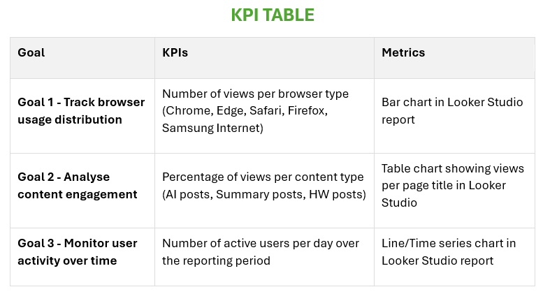
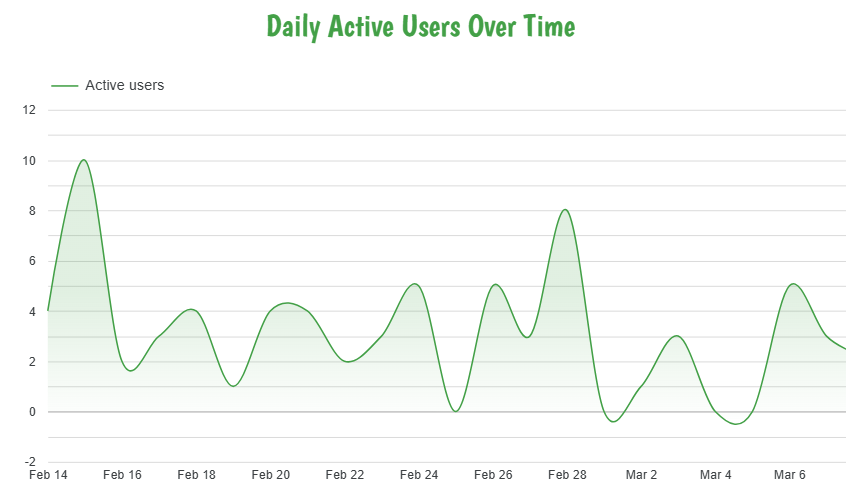
For this week’s assignment, I developed a KPI table with three clearly defined goals to measure the performance and engagement of my website using Google Analytics 4 data. The first goal focuses on tracking browser usage distribution — measuring how many views are generated by each browser type (Chrome, Edge, Safari, Firefox, and Samsung Internet) — visualized through a bar chart in Looker Studio. The second goal analyzes content engagement by measuring the percentage of views per content type, helping identify which categories of posts resonate most with my audience. The third goal monitors user activity over time by tracking the number of active users per day, visualized through a line chart in Looker Studio to reveal traffic trends and patterns across the week. Together, these three goals provide a comprehensive view of both my audience’s technical behavior and their content preferences, allowing for data-driven decisions on what to publish and how to optimize the site experience going forward.
KPI Table:
| Goal | KPIs | Metrics |
|---|---|---|
| Goal 1 – Track browser usage distribution | Number of views per browser type (Chrome, Edge, Safari, Firefox, Samsung Internet) | Bar chart in Looker Studio report |
| Goal 2 – Analyze content engagement | Percentage of views per content type | Percentage of views per content type |
| Goal 3 – Monitor user activity over time | Number of active users per day | Line chart in Looker Studio report |
Essay III — Summary of Looker Studio Report
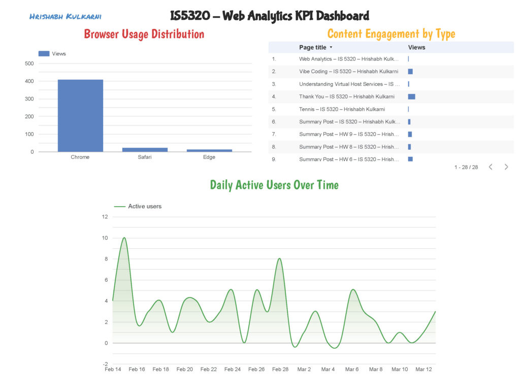
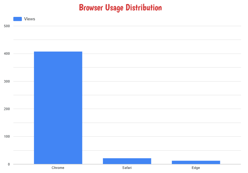
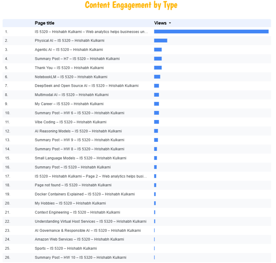
This week, I connected my Google Analytics 4 property (IS5320) to Google Looker Studio and built a custom report aligned with the three KPIs identified in Part II. For Goal 1, I created a bar chart displaying the number of page views broken down by browser type — the data clearly showed Chrome as the dominant browser among my visitors, followed by Safari and Edge, providing useful insight into which browsers to prioritize for compatibility testing. For Goal 2, I built a scorecard and table visualization showing the percentage of views per content type — AI-related posts consistently drove the highest engagement, confirming that my audience is primarily interested in technology and AI content. For Goal 3, I created a line chart tracking the number of active users per day over the reporting period — the chart revealed noticeable traffic spikes on the days new blog posts were published, demonstrating a direct correlation between content publishing frequency and daily user activity. The completed Looker Studio report has been downloaded as a PDF and submitted separately to Canvas as required.
Leave a Reply